
Movie Trailer App

UX DESIGN

O
VERVIEW
Movie trailer app is a mobile app designed for data saving users, student's & people who can't read
This is a conceptual case created as a part of my Ux certification
The problem:
Users feeling frustrated while using the apps contains more ads and excessive usage of data apps & un-understandable language.
The goal:
Design an app which helps users to overcome those all frustrations and easy to understand, like choosing language option, Accessible design with few clicks to complete the task.
TOOLS

Figma
DURATION

8 weeks
ISCOVERY
D
ROLE

UI/UX Designer
In my research I conducted qualitative and quantitative, for qualitative research I asked 5 basic questions like how much time do you use a movie trailer app & their best experiences & bad experiences about movie trailer apps, and I took 5 quantitative survey.
How do you watch movie trailer ?

Competitive audit
I did a competitive audit to find the competitor's strengths and weaknesses by downloading their movie trailer apps, and read their audience review comments, This gave me the clear idea about users pain points.


Apps
Multi-language
Data saving


D
EFINE
User persona


User journey map
Goal:-
An data saving movie trailer app
Kiran kumar

Goal:-
Easy app to understand movie trailer app
Indira rani

I
DEATE
User flow
User flow reflect's the user journey from launch of the application, exploring it's function to completing the task I created a user flow.

Wireframes
I started my design with pen & paper, later turned the samples into digital wireframes.
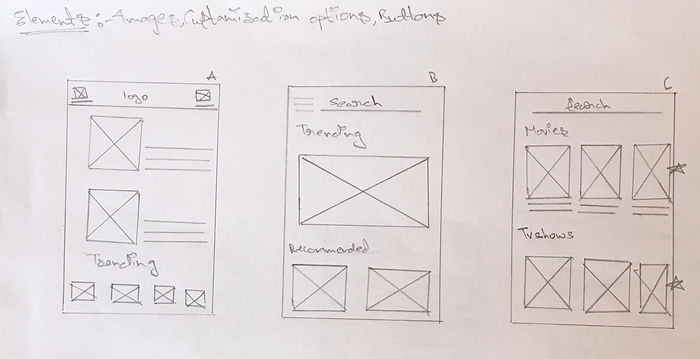

I created a Home Screen paper wireframe the v.1 represents the final outlook.
Digital-wireframes


D
ESIGN
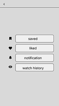
Low-fidelity
I started low-fidelity prototype based on the wireframes I created.
Iteration A


Iteration B

Managed the following steps into 1 screen so users can complete the steps easily.
Added the profile setting to slide elements, so users can access them both easily with simple steps

Visual design
Colors
#879DD7
#FFFFFF
#787977
#252B3B
#535C73
Font
Open sans
Helventica
Typography
H2 20pt
H3 15pt
Body 114pt
Icons
Buttons

Sign-in

Sign-up
Affinity diagram


High-fidelity design


High-fidelity prototype

T
EST
Testing & usability
After building the prototype, I tested the design with friends and family. Adding their feedback here.


Kiran kumar
"the app is really great the content and options are really great"

Indira rani
"It is so easy to access easy to understand".
Uday ram
"In first I can't find the genre and audio options, now it is really great to access".

Praveen
"I liked the app cooler and options, they are cool"
Meghanadh
"I loved simply clean look of it".
Recollect
This was my first case study after entering the UI/UX world, It was quite exciting to do. Since this was a conceptual case for my certification, I had to come up with everything from the scratch. It was challenging at first but I had lot of fun doing it. The project is overused topic, but for me it's already chosen. So, I tried to understand the pain points and discovered & designed a product.
I want to learning & design cool stuff!!!

THANK YOU for reading